
Turning Data Into Information Using ArcGIS
Module 3: Query and Measurement
Problem
The exercise objective is to explore different types of data using ArcMap 10’s catalog view. The problems involve selecting land use polygons, schools and census tracts that fall within certain watersheds, calculating population growth rates for census tracts, and symbolizing these tracts by growth rates and schools by their watershed value. Additionally, preferred sites for a vineyard are requested given a terrain surface and a road map.
Analysis Procedures
Different types of data and their properties can be explored easily with the use the Item Description Window in Catalog view. Metadata can also be viewed this way. Its format was chosen through the ArcMap Options dialog box under the Customize menu. Using the Create Graph Wizard from the View menu within ArcMap, allowed a bar graph to be created from a land use attribute table. When certain land use polygons were selected, the graph changed to reflect the selection. Right-clicking the bar inside the graph representing a certain land use and selecting the Identify tool, opens a window showing the selected polygon’s attributes while brushing (flashing) the data on the map. Population growth rates for census tracts were calculated using the Field Calculator and a formula (.cal file), then symbolized using graduated colors. To determine favorable sites for a vineyard, parameters of aspect, slope, elevation and distances from roadways were measured using a terrain surface, road map, raster calculator and Spatial Analyst, Logical and Distance tools. For instance, the Euclidean Distance tool referenced a freeways layer in order to determine straight-line distance from each cell back to the nearest freeway. Areas with nearby access to freeways were desirable. The combination of these parameters led to favorable sites.
Results
Below are screen captures of some of the exercise results.
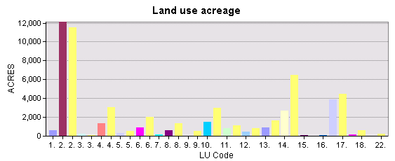
The bar graph above represents land uses in relation to acreage. The highlighted, yellow bars represent those land uses from a feature selected on the map.
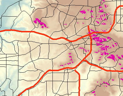
The areas in violet above represent the most favorable sites for a vineyard in California. The backdrop shows a terrain surface. Red lines represent freeways.
Application and Reflection
The exercises in Module 3 allowed for examining data attributes and metadata in ArcMap without having to open up ArcCatalog. Advanced queries would allow one to select all parcels of land that were part of a certain watershed of interest. A chart created from a property boundaries layer can quickly determine the number or acreage of residential versus commercial parcels within a selected area. Similar to finding a suitable vineyard, a farmer could determine suitable sites for discing fields or planting a garden.